Task 3 Sample Answers
CAEL Task 3 Speaking Sample for a Graph
Topic
This chart shows the library book borrowing habits of a small village population. Describe and explain the information you see depicted in the graph. What conclusions can you draw?
If you would like me to score your task, please paste your writing in the comments.
CAEL Speaking Sample Answer
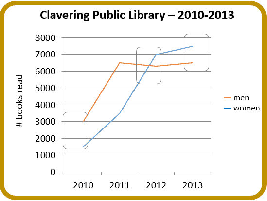
The illustration reveals the public library loans made to Clavering’s men and women between 2010 and 2013. The years are shown on the horizontal axis while the number of borrowed books is shown on the vertical axis.
Although the number of books that were lent to Clavering’s men and women over the three year period increased, women ultimately overtook men as the most prolific borrowers.
Initially women borrowed only half as many books as their male counterparts. That number rose steadily during the two subsequent years to reach 7000 books in 2012. At that point, the number of books being lent to women slowed considerably with only 500 more books being borrowed in the final year.
Men’s book borrowing stabilized after a rapid rise from 3000 to 6500 books in the first year. After 2011 the library’s loans to men settled down, neither rising nor falling significantly for the last two years of the period.
In conclusion, we can see that the borrowing habits of men and women changed during the time frame with women replacing men as the primary borrowers of Clavering library’s books.

CAEL Task 3 Speaking Sample for Bar Charts
Topic
These charts show the percentages of men and women in employment in three countries. Describe and explain the information you see depicted in the graph. What conclusions can you draw?
CAEL Speaking Sample Answer
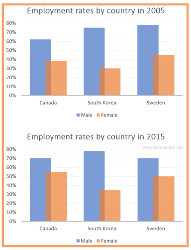
The charts illustrate men’s and women’s employment rates for Canada, South Korea, and Sweden during 2005 and 2015. Employment percentages are shown on the vertical axis, and countries are shown on the horizontal axis.
Overall, the proportion of working people increased during the period, with employed women showing the most significant increase.
In all three countries, the number of employed men exceeded that of women with Sweden having the highest rate of male employment – approximately 80% in 2005, followed by South Korea with 70% and Canada with 60%. By 2015, Canada had seen the greatest rise to 70%, Sweden had revealed an equal and concurrent drop, and South Korea’s employed men had risen by a mere 5%.
The proportion of employed women was lower than men in all of the countries during both years. It was below 50% everywhere in 2005, but the figures had risen by 2015. By then, over half of Canadian and Swedish women were working. South Korea’s numbers were significantly lower, rising from 30% in 2005 to 35% in 2015.
In conclusion, we can see that while all three countries witnessed an increase in employed women, South Korea was the only country where over twice as many men as women were employed during both years.
CAEL Task 3 Speaking Sample for a Map
Topic
The maps show some of the changes that have taken place in Dubai in recent decades. Summarize the information by selecting and reporting the main features and making comparisons where relevant.

CAEL Speaking Sample Answer
These two maps compare Dubai in the past and the present. Looking at the maps, it is clearly evident that this area has developed considerably and become more modern and populous.
The only feature which has remained the same during these decades is the clock tower roundabout. Only a few trees have been planted around the edge of the roundabout.
In the past, there were a few buildings around the roads and most of the land was empty, sand-covered wasteland. However, the look of the present-day Dubai is quite different from the past. Skyscrapers and high-rises have been constructed at the sides of the roads, and billboards have been installed. As a result of the increase in traffic, the roads are now much more heavily used.
Overall, therefore, Dubai has become more developed and populated. Countless high buildings have filled the area, and there is a lot of traffic.

CAEL Task 3 Speaking Sample for a Pie Chart
Topic
These charts show survey results of the priorities of people in two age groups. Describe and explain the information you see depicted in the pie chart. What conclusions can you draw?
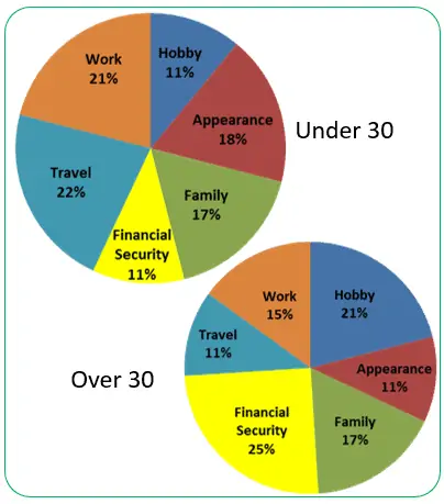
CAEL Speaking Sample Answer
The diagrams reflect the findings of a survey in which people over and under thirty were asked about their priorities.
By describing what mattered to the participants in percentages, the pie charts show that there are both similarities and differences between the two groups.
The older group tended to focus more on achieving financial security and enjoying hobbies than the younger participants. At 25% and 21% respectively these were prioritized by almost half of the over thirties, whereas at 11% for both, less than a quarter of the under thirties thought these mattered much.
The under-thirties tended to prioritize opportunities for travelling, being gainfully employed, and looking good. At 22% , 21%, and 18% respectively, these were prioritized by almost two-thirds of this group’s members, whereas at 11% for travel and appearance, and 15% for work, less than half of the older group felt these categories were critical.
It is encouraging to see that both groups felt family was a priority. A full 17% of both groups prioritized family over the other options.